the tosijs icon system

Susan Kare designed the original Mac icons. Aside from switching to color in the early 90s and then using anti-aliasing this pretty much was how icons looked for 15 years (20 years in the Windows world).
Icons have been a core part of graphical user interface design at least as far back as Xerox PARC.
Apple standardized on 32x32 px bitmap icons for most purposes (smaller icons were used for things like menus) and supported that via ICON and ICNS resources. You could have 32768 resources of a given type—this would actually be adequate for even most of today's applications—and you simply invoked them by resource type and id, or you defined a constant.
System Resources had negative ids, so you could call system icons using their (negative) ids.
All of which is to say that Apple and NeXT knew how to deal with this stuff in an incredibly simple and robust way. But not so much the web stack. In any event, until custom fonts and SVG became widely supported, the constant increase of bitmap resolutions has kept us all on our toes.
SVGs and Resolution Independent Icons
With the widespread support of custom fonts and SVGs it became possible for icons to be resolution independent and typically quite compact. Custom fonts were particularly powerful because you could turn a glyph (character) in a font into a custom icon and then use CSS magic to insert that glyph by name into the DOM and voila, scalable, stylable icon. If you could insert an SVG into the DOM bare (i.e. not embedded in an <img> tag) you could even style it, because SVG was supported directly by the browser.
This led to several rival approaches for inserting SVGs into the DOM:
- Custom Fonts (convert your SVGs into a font, use CSS / code magic to insert icons)
- Custom Builds (convert you SVGs into code, use code to render the SVGs in the DOM)
- Direct embedding (use SVGs as images)
- Complex approaches involving SVG ids and other stuff I don't understand
The most popular approaches were the first, exemplified by iconmoon and second, widely used by different react libraries.
One thing all these approaches had in common is that they tended to work well for exactly one library. So MUI might have a great icon system but good luck using its icons with something else. And the second approach tended to mean using a specific build system as well. In my opinion the best build system is no build system and the second worst is someone else's build system. The absolute worst is a build system maintained by Facebook.
Since I started building my own frameworks, the goal has always been to have a single source of truth for icons, no magic or convoluted tooling, and be able to quickly and easily add and replace icons, distribute them with components, and have no mess or fuss, but there have always been tradeoffs.
2017 — in b8rjs I used icomoon.io, which I still think is a solid choice for managing custom icon fonts. But…
- color icons are flaky,
- doesn't play well with others,
- can't really distribute the icons with your components.
- difficult to use icons in CSS
content - impossible to use icons in CSS backgrounds
2021 — processing Icomoon selection.json files into icon-data and then generating SVGs dynamically from the data.
- no fancy SVG effects, like gradients (goodness knows I experimented with converting CSS gradients to SVG gradients) and, most
- strokes need to be converted to outlines
- outlined strokes can't be styled the way strokes can
- blocks use of popular icon libraries
2024 — ingesting SVGs directly, with a little cleanup, and then using a proxy to insert them into the DOM.
- no build magic needed:
defineIcons({ myIcon: '<svg....>', ... }) - smaller icon files, even though I'm now including more icons (including all the current feathericons)
This gets us to tosijs-ui 1.4.x. You dump all your svg icons in a directory, organize them how you like, put specific kinds of icons in subdirectories to indicate their properties (e.g. stroked icons are recognized if there's a stroked directory in their hierarchy), and it builds an icon data file tosijs-ui's icons proxy can use.
Basically, icons.lock() renders an inline <svg> of a lock. It can be styled with CSS very easily. <tosi-icon icon="lock" size=128></tosi-icon> wraps that icon in a custom-element which will change the icon if you change its properties. So we have:
- inline SVGs that can be styled by CSS (for buttons, etc.)
- both stroked and filled icons (unlike font-based systems)
- support for color icons (without requiring multiple glyphs perfectly aligned)
- icons can be rendered as data urls, e.g. to insert into CSS… (the little
owllogo rendered under blockquotes is an example)
And also:
- no build process magic needed (your icons are "just javascript", no special CSS files needed, no magic glyph mappings). Adding new, or overriding existing, icons is trivial.
- if you want automatic custom builds,
make-icon-data.jshas no dependencies, finds icons and creates anicon-data.tsfile. - icons are just regular SVGs, not a specialized subset.
- the icons are highly optimized and compressible (the code is comparable in size to what you get with a compressed font built from the same icons, except icon fonts don't support strokes, gradients, etc.)
Icon Composition
With 1.5.0, tosijs-ui's icon system adds three major new features:
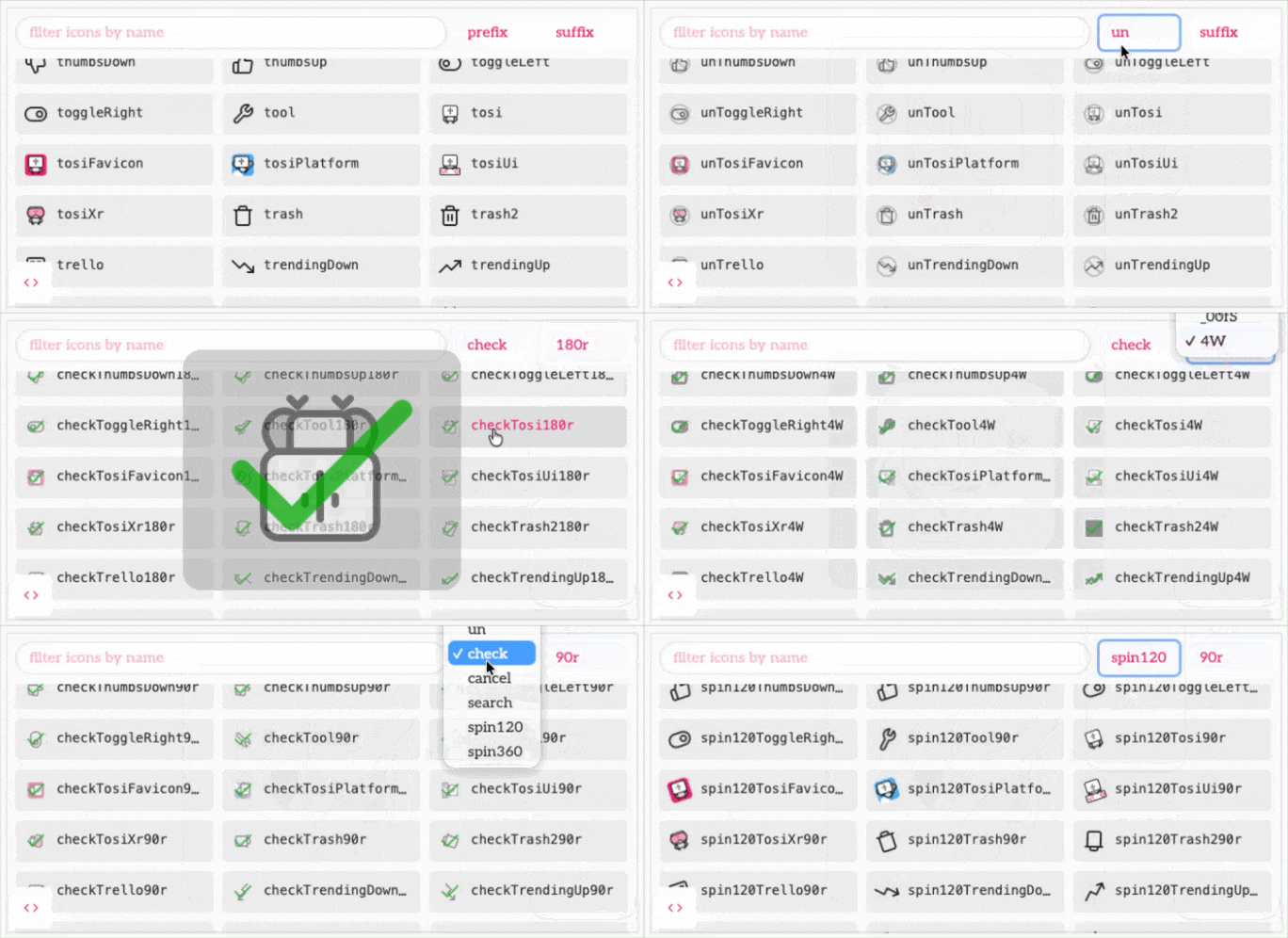
- icon composition: stack, transform, and style icons via naming conventions (e.g.
lock50s75o$shield) - extensible rules system for custom prefixes and overlays (e.g.
unLock,checkFile) - icon redirects eliminate redundant SVG data (e.g.
chevronDown→chevronRight90r)
Why?
What if we could just tweak, arrange, animate, and compose icons on-the-fly?
Using similar syntax sugar to the way tosijs handles CSS variables…
Suddenly you can do more, with less, faster and more consistently with less code and less data…
The Pin Saga
I needed a pin icon for column pinning in the data table. The only pin in the feather set is a map pin, so I created a push-pin icon. It's the icon above (except I made it pink using new features of the icon system).
Why did I need a pin? Because tosijs-ui's virtual table component now lets you pin columns.
But immediately I also needed un-pin, pin-left, and pin-right — a lot of new icons for one feature. Of course I could flip the pin with CSS, but this is a problem everywhere, all the time: every directional icon needs 2–4 variants, every action needs a negation, every status needs an overlay, every entity needs to be created, deleted, and so on.
Why not fix it once and also eliminate the need to maintain trivial variations on every icon?
What if flipHPin horizontally flipped the pin?
That's so yesterday! Today it's
pin0f. The icon system now fully leans into tosijs's CSS syntax sugar, including directly using it to embed CSS variables into icon changes, solock25ois a lock icon with opacity 0.25, andlock_brandColorSis a lock withstroke: var(--brand-color).
And once you have transforms and overlays, you have an icon language…


And the cost in code was offset by eliminating core icons that were simply transforms of other icons. E.g arrows and chevrons, rewind is just fast-forward flipped.
Hiding the DSL
OMG another DSL? Well, yes but with three mitigations.
First, you can alias a name to a transformed icon. So unPin can be mapped to pin0f
and it works (almost) exactly like there was an unPin icon.
Second, we lean into tosijs's existing system for handling CSS variables and colors, so it looks like existing tosijs code.
E.g. in tosijs, vars.buttonPadding_50 produces calc(var(--button-padding) * -0.5) and
vars.textColor50o becomes a 50% transparent version of var(--text-color).
In the icon system lock50o becomes a 50% transparent lock icon, and lock_brandColorS
becomes a lock with stroke: var(--brand-color).
Finally, there's a clue in unPin. The un is a custom rule that looks like this:
{
  prefix: 'un',
  apply: (baseName) => `slash25o$${baseName}75s75o`,
}
And spin is a rule that looks like this:
{
  prefix: /^spin(_?\d+)/,
  apply(baseName, match, parts) {
    const dps = (match as RegExpMatchArray)[1].replace('_', '-')
    const duration = 360 / Math.abs(parseFloat(dps))
    const direction = dps.startsWith('-') ? 'reverse' : 'normal'
    // Resolve baseName with suffixes intact — they apply to the icon
    const icon = resolveIcon(baseName, [])
    const el = icon as HTMLElement
    if (el.animate) {
      const base = el.style.transform || ''
      el.animate(
        [
          { transform: `${base} rotate(0deg)` },
          { transform: `${base} rotate(360deg)` },
        ],
        {
          duration: duration * 1000,
          iterations: Infinity,
          direction,
        }
      )
    }
    return wrapIcon(baseName, parts, icon)
  },
},
Why do we use Web Animations and not a simple CSS animation? First, you'll notice we compose the transform with the icon's existing transform (vs. create a new animation for every icon based on, say, a hash of its existing transform) but more importantly it works inside the shadowDOM.
So spin90Loader is a loader icon that spins (clockwise) at 90 degrees per second.
This lets you turn frequently used icon compositions into simple (or not so simple) rules that just become part of your icon vocabulary.
Conclusion
Back in the early 2000s I was asked to design an icon system for an Avaya PABX project.
What's a PABX? It's that thing that answers phone calls that isn't a human being but might, eventually, route you to one. You know, the robot that says "para español, pulse dos" and responds to the tones on your phone.
The goal was for every function in the system to have an icon representation. The number of functions was enormous so the goal was for the icons to constitute a "language" of "verbs" and "nouns" that could be composed in a consistent way.
Yes, the icons marked 16x16 actually had to be rendered at 16x16 and look good.
This was literally designed as a giant set of layers in an Illustrator document, loaded into Photoshop, and then each individual icon was configured as a specific set of layers and exported in multiple file sizes. Today, with this system, you could go straight from source vectors to the screen, and compose your icons (and fine tune them) on the fly.
And with this system's custom modifiers you could also make ringing phones "jiggle", talking users "speak". The possibilities are endless. You even get things like if the icon for a menu item is verbPhrase, then you can make the icon for the cancel button unVerbPhrase and the button for deleting the new thing deleteVerbPhrase after, say, writing a custom rule that turns delete into a trash icon overlay, maybe scaled down and colored with your var(--action-color).
So instead of my old Illustrator → (make paper notes) → Photoshop → (consult notes) → Export Images workflow, where if someone doesn't like the skin color of the user icon I need to rebuild everything.
And if you're using one of the other icon systems out there, life hasn't really gotten much better in 25 years, you just probably don't need to switch apps or export multiple sizes, and if you do Illustrator and Photoshop are scriptable.
I used to use Font Awesome as a source for icons. (I think I contributed to the kickstarter funding the previous major version.) It currently has 801 icons that match "shirt" (some of them are definitely not shirts). But what if I want an addShirt icon? What if I want it in my var(--brand-color)?
Now we can create each element as an SVG, the name of the icon defines how it's built out of elements. unLock, spin120Loader_brandColorS$downloadCloud. If we change --brand-color, everything updates automatically. If we redesign the cloud, ditto.
No build magic needed.